A Sneak Preview of the M+ in West Kowloon
A friend of ours works at the Xiqu Centre in West Kowloon and from time to time she invites us to special events at the cultural hub of West Kowloon. This day we got tickets to the M+ Appreciation Day, which allowed us a sneak preview of M+’s interiors and exhibitions.
The M+ is the art gallery in West Kowloon. As a full-service exhibition venue, the M+ provides ample space (17,000 square meters) for cultural viewing in all forms and manners. From levels B2 to 2, there are 33 galleries, 3 cinemas, a mediatheque, a learning hub and a roof garden. Together these will offer a wide variety of experiences for all age groups.
The M+ Cinema
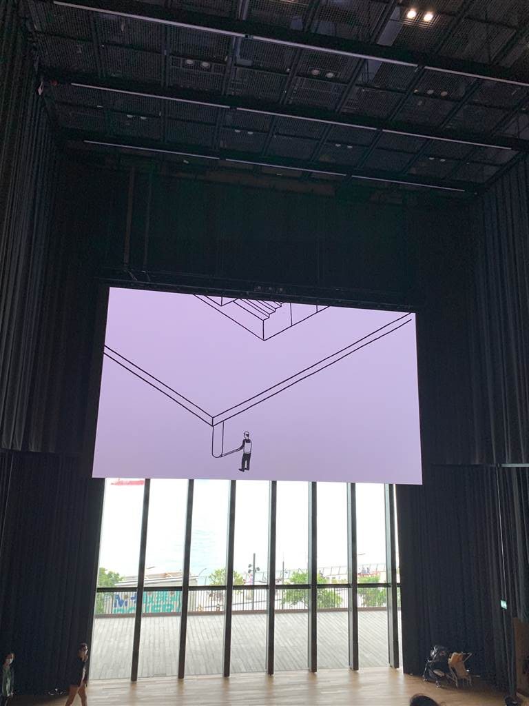
We began our tour of M+ at the cinema. We watched a screening with four to five short films about different aspects of art in Hong Kong. The films concerned the creative process, including a cartoon rendition of the building of the M+ structure, and interviews with a photographer, an industrial product maker and an installation artist. The short clip “Fly Through M+” shows drone footage throughout the museum. It was pretty cool.
For this screening, we watched a large screen that took up the upper half of the viewing space. The bottom half is a large window pane showing a view of the Hong Kong Island skyline as its backdrop. This was an interesting setup, as the arrangement allowed natural lighting into the theatre during viewing. Also worthy of note is the seating of the cinema. People sit on the large steps freely. I think this arrangement creates a sense of the open and the participatory Together the experience is reminiscent of outdoor viewing of movies, though certainly much more comfortable in an artfully-designed setting.
Exhibitions
We finished the screening at the Cinema, and headed up the steps to reach the showrooms on Level 2. Long lines have already formed at the West Gallery. However, we took a quick walk around this level first.
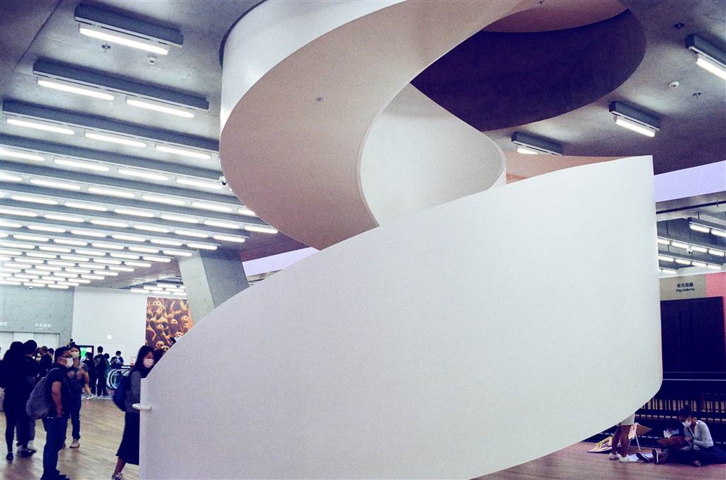
In the middle of Level 2 there is the very beautiful spiral staircase right in the middle of the atrium. When it does open for public access, the staircase leads one to the roof gardens.
The Focus Gallery
In the Focus Gallery we saw this following installation:
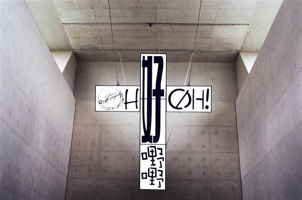
As a Christian I viewed this art with an inkling of discomfort. I do think that the image of the cross is sacred. I have general issues with postmodern art, in that I think many artwork these days aim to convey provocativeness at the expense of the aesthetics. This piece would belong to this category in my view.
The West Gallery
We did not know what the West Gallery was showing, but the long line there seemed to suggest that it was worthwhile to wait for it. It took us about ten, fifteen minutes of waiting before we were admitted.
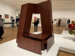
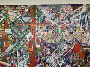
Generally, I did enjoy some of the pieces on exhibition there. However, again I take issues with the seeming lack of focus in the collection. Surely, there were prominent themes there, especially in the many pieces in the design category. But throughout the exhibition there did not seem to be a uniform organization of these prominent themes.
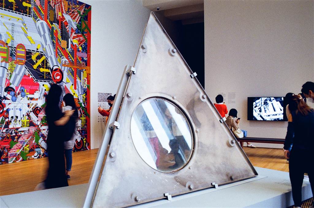
One minute I was looking at a Vivian Tam re-interpretation of the qipao, then the next minute I stared into Mao-era pieces, clearly of historical nature. I think the mix-match of the artwork was distracting. Because the exhibition did not progress in a coherent vision, I did not feel like I had a dialogue there. With each piece I had to learn the history, context and purpose of the artwork anew. As such, I got tired very quickly. My attention did not last through to even half of the huge collection there.
I do recall having this same feeling at the Hong Kong Museum of Art as well. I then thought that perhaps this is just the latest trend in museum curation. Maybe the only museum at which I would feel home is the history museum, as I do prefer engaging in a narrative when touring an exhibition.
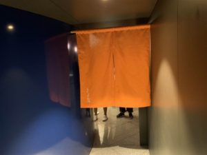
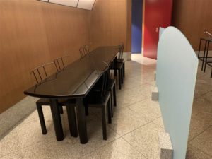
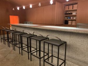
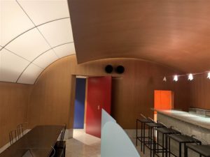
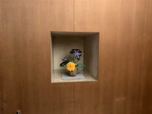
When the whole group of friends managed to gather together, we lined up together for yet another exhibition within the West Gallery. This was an interesting exhibit for all of us, as it was a reconstruction of an old sushi restaurant in Japan. I was quite silly because I thought this would actually become a restaurant, but it was really only a reconstruction of the interiors of the sushi restaurant Kiyotomo Sushi Bar. According to the captions on-site, the interiors “created a theatrical atmosphere for dining. The contrasts of light, movement, and texture in the design captured designer Kuramata Shiro’s sensual use of materials and forms.” See this for yourself here:
For the brief one minute we spent in this space, I managed to regain my calm. I was getting quite frustrated by the huge collection of seemingly unorganized exhibits prior to this.
After the West Gallery, we proceeded to the Main Hall Gallery on ground floor. Again, there was a long line, and this time I did not join the friends in seeing this exhibition.
The M+ Building
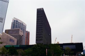
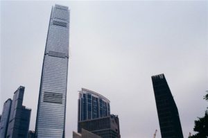
The M+ Building is the first structure in West Kowloon if you enter from the way of the Elements. Swiss architects Herzog & de Meuron entered an international competition in 2013 and won the project.
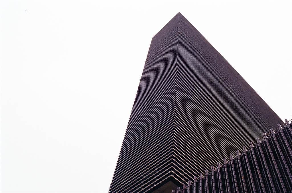
To be honest, when I arrived I was a little taken aback by the design of the building. It is basically a wide bottoms block (the podium) with a slender top block upon it, shaped like an inverse T. Because of the horizontal bars that gird the whole slender tower, the structure looks like a CPU of a desktop.
This surely is my humble opinion. I certainly do not have the training to understand and to appreciate how marvelous this design is. Perhaps then I can quote the M+ website in explaining the groundbreaking architecture at M+:
The M+ building is supported by a giant structural system of five high-strength mega-trusses that was installed to distribute the weight of the building across the site without resting any load on the underground Airport Express railway tunnel. The sophisticated engineering system also creates vast column-less spaces that allow for a flexible reorganisation and new perspectives for viewing exhibitions.
Speaking of interesting architectue at the M+, the Found Space is also made to accommodate the operation of the rail link close by:
Found Space is a cavernous exhibition space that was excavated along the contours of the Airport Express railway tunnel running beneath the building’s site. Originally presented as a design challenge to the architects, the pre-existing tunnel became the basis for the building’s form. The space unifies the basement and ground floors with a broad diagonal opening, providing visitors with an open area that extends across multiple floors. The triple-height space offers many vantage points for viewing the works on display. The textured fair-faced concrete and exposed load-bearing structures maintain the industrial character of the site.
The M+ will officially open its doors on November 12, 2021. There was much enthusiasm on this Appreciation Day. And it is certain that the grand opening will draw an even larger crowd. Therefore be prepared to queue up for events!
Sources
M+ Map, Distributed on-site at M+.
The Website of M+.
